00:00
00:00
HeartisttheArtist
it’s like heart and artist do you get it

Ya Boi @HeartisttheArtist

Age 24, Male

me make art

student of the universe

new ground dot com

Joined on 4/5/17

Level:
35
Exp Points:
13,297 / 13,600
Exp Rank:
2,226
Vote Power:
7.65 votes
Art Scouts
10
Rank:
Town Watch
Global Rank:
68,921
Blams:
0
Saves:
103
B/P Bonus:
2%
Whistle:
Normal
Trophies:
3
Medals:
385
Supporter:
1m 1d

HeartisttheArtist's News

Posted by HeartisttheArtist - December 31st, 2021


Hello everyone, happy new year! I was a little more than halfway through making this post when my computer decided to give up and forced me to start all over. I'll try my best, but this might be a bit rushed. These pieces aren't listed in any particular order, they're being showcased because they best reflect how I've grown and evolved as an artist, and also show what I need to improve. At least, they do to me. I'd love to hear what you think down below, I always love getting feedback from you all!

Shoutouts to @BombsAhoy since I'm all but plagiarizing his post. That aside, I hope you enjoy it!


#1 - Mandalorian Monday

iu_512401_6330226.webp

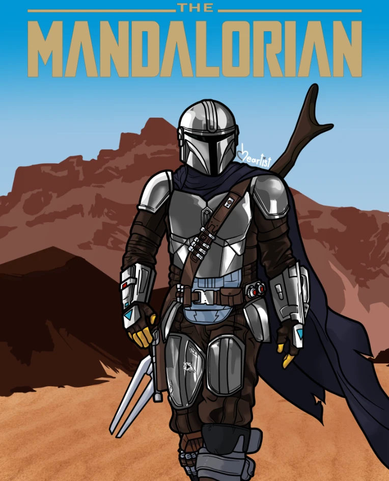
This was my first piece uploaded in 2021, and I'm still fairly proud of it. I've always loved drawing shiny metals, with or without battle damage, and this piece was an experiment in drawing shiny metal differently than I usually do. Mando himself looks pretty good, I paid just as much attention to the rest of his outfit as I did his armor. The shading on his undersuit is actually much softer than I usually would draw. I think the background is fine, but I do wonder if I should've had lineart for it. Without the thick black lines I usually have, like seen on Mando, it ends up looking a little bare. It's a fine background, but since he has them and it doesn't, they end up looking good independently of each other.

I also think I distracted from the art when I first posted it by putting a truly unnecessary mountain of text in the description. I ended up talking almost exclusively about the modern state of mainstream American pop culture, barely mentioning The Mandalorian as a show, let alone the character himself. I didn't really talk about the art I had made. That essay, well-written as it was, and as important as it might've been to say, should've been posted somewhere else.


#2 - Lord Zedd's Dark Rangers

iu_512403_6330226.webp

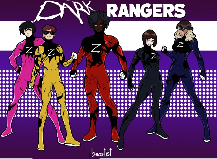
This one is a mixed bag for me. In some ways, I showed that I can draw a wide variety of different characters, but in others, I ended up looking like I can only draw two different types of characters. The faces are the highlight of this one, but everything from the neck down is lacking. Despite striving to make them more unique, all the differences between the team members is surface-level. The Pink and Yellow Rangers, as well as the Blue and Black Rangers, look like they share the exact same body type, save one being slightly taller. Each duo has the one generically "slim, kinda tall boy/girl" body type. The Red Ranger has the most distinct physique, and even then he's too similar to the other guys on the team.

I made this one with the intention to try and do the concept better, only looking at it now fell into the exact same kind of pitfall. None of them are really distinct, save for the colors of their outfits and what specific way their armor is cracked. If I ever draw this team again, I'd push to make each member more distinct as a character.
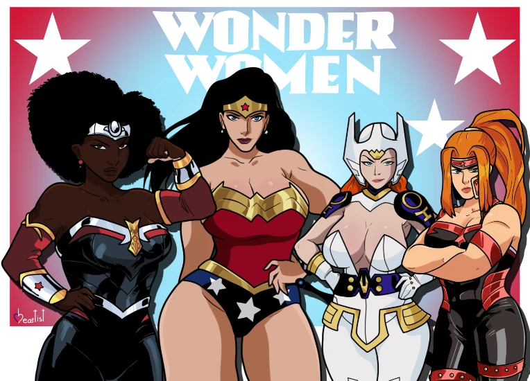

#3 - BARRIER BREAK

iu_512402_6330226.webp

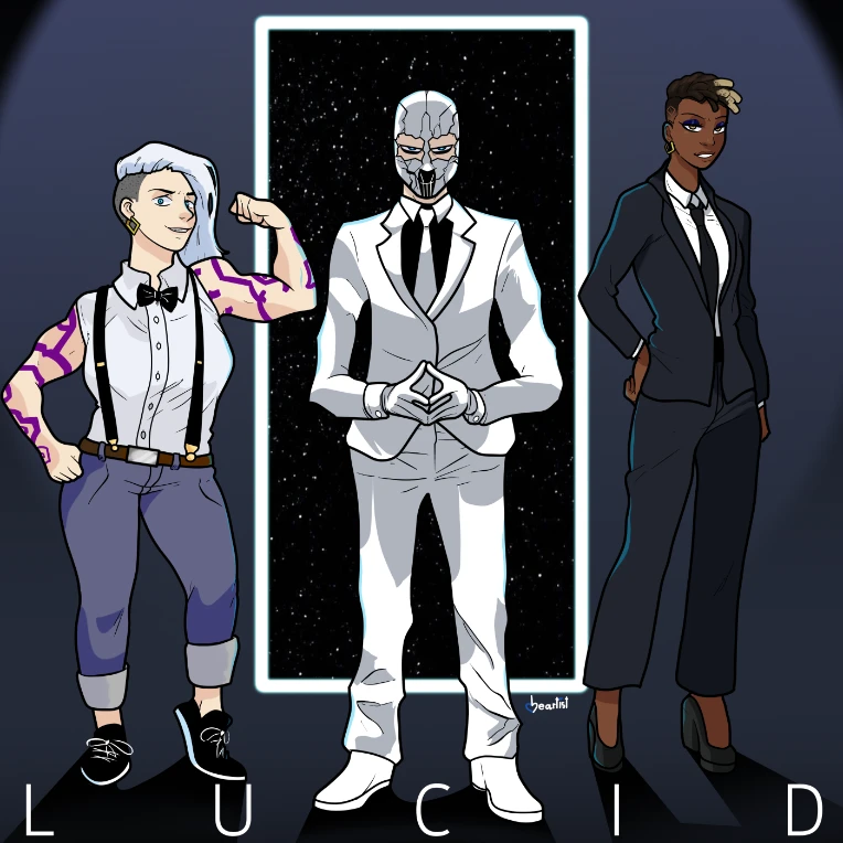
Ironically, this piece came out well before the last one, yet it does what the Dark Rangers sorely lacked. Each character is far more distinct and unique, having a strong sense of character based on the way they're dressed, standing, and their facial expressions. You can look at each one and get at least some sense of what they're like. The background is a little lacking and I wish I'd adding shading to the Man in White's shows, but overall it's pretty good. The characters themselves are done well, which is a good thing cause they're the focus and all lmao

This is probably because @Ecko-AI 's OCs have established backstories and personalities, there's much more to latch onto and understand with them. These are characters from his wecomic, which you should go read. He and I and other friends of ours had a lot of long talks about our OCs this year, and I look forward to doing it a lot more.


#4 - Ultraverse Taskmaster

iu_512406_6330226.webp

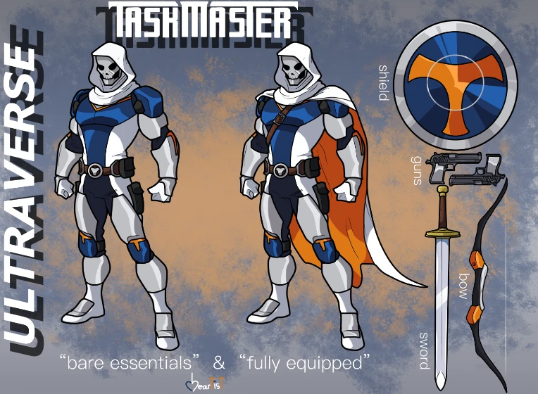
I made a lot of redesigns this year, and by far this is my favorite one. @EarthRabbitDraws really made my day when he said that my design made Taskmaster cool and menacing while still staying true to his core design. The only thing I'd change would be making the upper arm guards orange, but other than that, I'm fully satisfied with and quite proud of this design. An incredibly old drawing I made of Taskmaster and uploaded here is one of my worst pieces of all, but it did also lead to my improvement as an artist, one way or another. This design is the standard I'll be holding all my future Ultraverse redesigns up to.

I'd also like to take a moment to give rightfully deserved credit to artist George Pérez. He was the designer behind Taskmaster and Deathstroke, as well as many other genre-defining works in comics. His announcement earlier this year was truly heartbreaking to read. The world has lost too many inspiring creators in the last few years, and will never be the same without him. We wouldn't have comics as we know them without his works, and he has my eternal thanks for that. My heart goes out to him and his loved ones, and all who have appreciated his works.


#5 - Doodle Dump: Ikari

iu_512408_6330226.webp

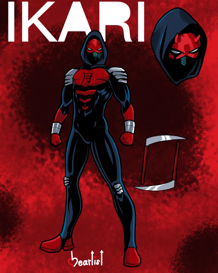
Whenever I prefix a post with 'Doodle Dump' it means that I focused on the one singular main subject, and everything else was more or less an afterthought. The background in particular is usually a last-minute addition, but at least I've improved enough to no longer make it a single, flat color.

Like with the previous Taskmaster, and unlike the Mandalorian, I managed to keep the overly long description relevant to the art itself as well as the character and their source material, as well as my relationship with it. I spent a majority of the description gushing over Waid and Samnee's 2011 run on Daredevil, especially Ikari and his arc. It helped to contextualize why I have such a love of this character, who might otherwise be completely irrelevant.

I tagged this piece a mashup rather than a redesign, because frankly that's what it is. It's Ikari's head put on Daredevil's Fall From Grace costume. I think they blend together remarkably well(and in my personal opinion looks better than Ikari's official outfit), but I couldn't rightfully call it a redesign. This is where my lessons in gesture drawing and anatomy from my Drawing II schoolwork really started to take hold in my personal art, where characters began to feel alive. Even under the armor and the suit under that, Ikari feels like he has depth and form. Muscles are well-established, his anatomy is more lifelike, etc. I'm very satisfied with this one.


#6 - Hell on Wheels

iu_512409_6330226.webp

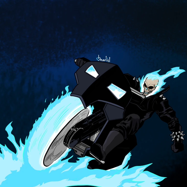
This was my most popular piece of the year, by a landslide. I certainly wouldn't have 400+ followers if not for this. I'm not entirely sure why this is the one that got so much attention, but you certainly won't hear me complaining!

For as loved as this one seems to be, there are parts of it I wish I'd changed or fixed. I practiced drawing fire a lot this year, you can see my practice for this piece in a previous one. The fire here looks alright, but not great to me. I'm not sure what it is, but it doesn't quite feel like raging fire to me. The flaming wheel looks correct, if nothing else.

Despite being one of my most action-packed pieces of this year, it's not terribly dynamic. That's something I plan on changing in this coming year, having a much more dynamic sense of action in my work. A lot of my characters are just sort of standing around or leaning.

All in all, maybe I don't think it's that great, but a lot of people certainly liked it. No problem with that!


#7 - Burgerpant(ie)s

iu_512410_6330226.webp

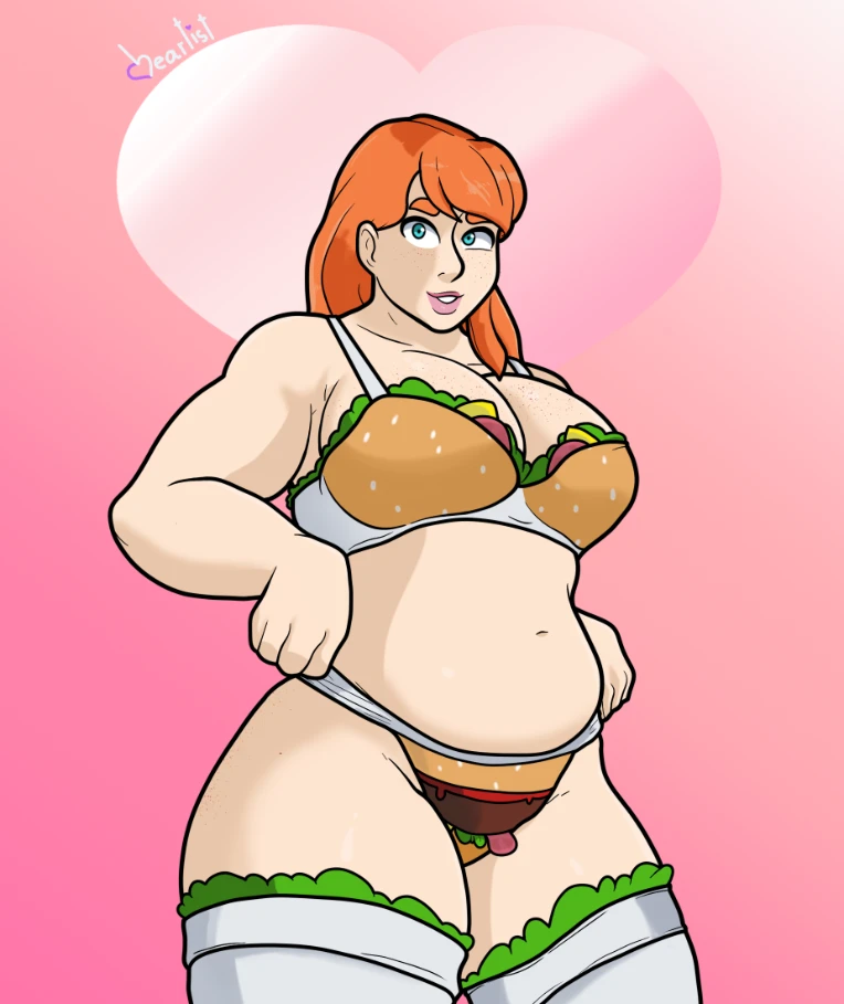
I think this is would have to be one of my favorite pieces from this year. It's where I really started grasping my style and taking it to the next level. A lot of people responded to this one and admired the balance of cartooniness and realism, something I've always strived for. The shading also got a lot of praise, something I'm glad to hear. I've always shaded in a blockier, comic book style. Her face looks a little strange but everything else ended up looking great. I think this is also where I really started getting into drawing different body types, if this was earlier in my career Saoirse would've ended up looking less good. She's a character who I'd been wanting to bring back for a long time, but wasn't sure about. Mostly because I wasn't sure what to do with her as a character, but also because I wanted to be able to capture her body type correctly. After a long time, it paid off and she made her reappearance!


#8 - Sanctuary

iu_512411_6330226.webp

I need to get into drawing backgrounds and environments more, and this piece was me dipping my toes into that. I wanted to be able to draw(heh heh) an emotional response from viewers without having a character in the piece. I'm pretty happy with this one, it showcases my growing skill with colors.


#9 - OC Character Sheet: Max Vanguard (Armor)

iu_512412_6330226.webp

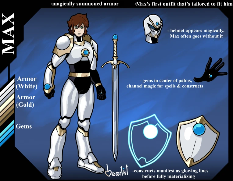
This is one of my absolute favorite art pieces I've made this year, and one of my favorite art pieces I've made yet. I went into greater detail about it in the post itself, but finishing this character sheet really felt like I was finally capitalizing and capturing all the ideas I'd failed to capture when I made the initial version. A stronger sense of character, a better design that more cohesively portrayed and blended all the concepts, everything about it feels leagues ahead of my first attempt. I'm really proud of this one.


#10 - 400+ Follower Thanks!

iu_512413_6330226.webp

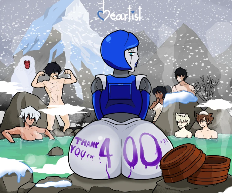
One of my best works yet.

Phat Gynoid ass aside, the level of detail in this piece was almost harrowing to draw but incredibly satisfying to see completed. I wanted to truly show my thanks for so many followers, and didn't want to give them anything less than my absolute best. My resolution for 2022 is to draw my OCs a lot more, so expect to see more of everyone pictured here!

Except the monkey.

Maybe.

Also, fun fact, this is the only piece where Valerie is depicted so far where she's smiling!


That's all for 2021, I really hope that you enjoyed this look back!

If you didn't see your favorite work of mine listed here, be sure to tell me down below! I'd also love to hear what you liked about my art in particular, what you think I should do more or less, and what you'd like to see next!


I love you all very, very much. May 2022 bring you happiness, health, and good fortune.

Keep being cool, everyone!

Big love.


Tags:

7

Posted by HeartisttheArtist - December 30th, 2021


Hey there, everyone! I've seen a few different creators I follow making posts like this, I figured I should swoop in at the last minute and put my two cents in. A few short updates first:


  • I recently reached over 400 followers here on Newgrounds, thank you to all the newcomers and the ones who've stuck around! As I've expressed many, many times before, Newgrounds has made an incredible impact on my life in so many ways. You all have my thanks from the bottom of my heart.


  • I'm going back to school for second semester, updates might be rarer but I don't want to go completely silent like I did before. I'm looking forward to finishing my sophomore year.


  • I plan on finally opening and taking commissions! I've been unsure about it for a very long time, but I think that I'm finally happy enough with my art to do it. Better late than never, I suppose, lol


  • Honestly, I've been making some changes and as a result, have been feeling much better as a person. I'm really excited to continue to improve as a person, and to see it pay off. I've been making new friends, meeting up with old ones again, enjoying time with my family, and many other things. I hope to continue to ejoy these things in 2022, and I really hope that everyone else has just as good an experience. 2021 and the past years before it have been difficult for me, and even more so for others in ways I can't even imagine. I pray that everyone is able to have a safe, happy, healthy new year.


My friend @BombsAhoy (who you should go follow) just made a post about his favorite works of 2021, going into detail about his process and thoughts behind them. I really enjoyed reading it, and I'm wondering if you guys would like to see something like that from me. Be sure to let me know!


As always, big love. Stay cool, y'all.


Tags:

3

Posted by HeartisttheArtist - October 8th, 2021


Hey there, folks! It’s ya boi.

I’ve been in the mood to draw some spooky, Halloween-related art, but I’ve honestly been at a loss for what to draw.


I figured I should ask you all directly! What better way to figure out what to give you than to ask?


Look through my art and check out my OCs, and leave suggestions and/or requests for Halloween costumes to put them in!


I hope you’re all doing well, and I hope to hear from you soon! Love y’all.

iu_440726_6330226.png


Tags:

3

Posted by HeartisttheArtist - July 16th, 2021


As a thank you to you all, here’s a special treat: what June looked like when I first drew her! This is from back when I used to draw exclusively in the traditional medium, now I draw almost exclusively digital art!


Please forgive my fucking abysmal handwriting.iu_359452_6330226.png


Tags:

5

Posted by HeartisttheArtist - July 5th, 2021


Have this drawing I made a while ago, I hope you like it and that you had a great day!iu_349438_6330226.webp


Pizza time.


Tags:

6

Posted by HeartisttheArtist - June 16th, 2021


iu_332610_6330226.png


7

Posted by HeartisttheArtist - May 20th, 2021


Kentaro Miura, the author of Berserk and master of his craft, passed away yesterday.

 I used to loathe Berserk and not want to read it because my brother wouldn’t shut the fuck up about it. He clearly liked it just because he thought it was all about sex and violence. It wasn’t until I read it for myself that it really impacted me, and after I did, it helped get me through difficult times in my life. Miura is a fucking inspiration and the world is a darker place without him.

Thank you for sharing your story with the world.


iu_309821_6330226.png


Tags:

10

Posted by HeartisttheArtist - April 21st, 2021


iu_284521_6330226.webp

I purposefully didn't identify the four Wonder Women depicted in this piece, because I wanted to see if anyone would be able to identify any of them!

But you know me, I love oversharing and making insanely esoteric references. So here's who they are and some of my though process behind each one!


iu_284520_6330226.webp

Diana

No words are needed. It's Diana, you've seen me draw her. She's the best of the best. OG, cannot be matched.

You can see she's been visibly slimmed down from the last time I drew her, which really just came down to personal preference and opinion. I thought I went overboard and so toned it down.


iu_284519_6330226.webp

Nubia

Nubia is a pretty interesting character, IMO. Debuting in January of 1973, she could arguably be called DC's first black woman superhero character, but the Teen Titan Bumblebee, who debuted three years later, has also been given that distinction(granted, Bumblebee is more of a traditional costumed crimefighter). Nubia(occasionally styled Nu'Bia) has had a wide variety of incarnations; from Diana's long-lost sister, an unrelated(hah) Amazon contemporary Wonder Woman, a parallel-universe Wonder Woman, or a future inheritor of the mantle.

I gave her an outfit with the idea that she is Wonder Woman, but isn't replacing Diana. Similar enough design cues that you can tell they're both Amazons, but different enough that they're clearly from different cultures. Nubia has the sort of "ribbed" top that most Wonder Woman designs have nowadays, as well as the hotpants of the New 52 Wonder Woman design. The dragon head in the middle of her top is an homage to her debut, which had a dragon crest on the breastplate!

In terms of build, Nubia is absolutely cut. She's fit like Diana, but doesn't have a bit of fat on her.


iu_284522_6330226.jpg


iu_284523_6330226.webp

Artemis of Bana-Mighdall

The only other Wonder Woman that has arguably reached mainstream success. At least, she's more well-known than some of the others. She's teamed up with Red Hood, so it's not like she's completely obscure.

Unlike the other Wonder Women, the metallic parts of her suit aren't silver or gold. They're primarily red, with small accents of gold. Combined with a more outright aggressive and borderline hostile personality, she makes quite the distinction for herself.

In terms of build, the goal was "buff." The warm colors combined with that made me think of Jasper, from Steven Universe.


iu_284524_6330226.webp

Bekka

Bekka is the Wonder Woman from the animated film Justice League: Gods and Monsters, which is... criminally underrated. I cannot recommend it enough. If even one more person watches it, I'll be satisfied. The universe it shows is so distinct, so far removed from what we know, but still recognizable in some way. Everything in it feels intentionally placed and exhaustively thought-out, nothing feels like it was just thrown in because the creators behind it thought it would be cool. The dark tone never feels excessive or overpowering, it always feels intentional and fitting.

What was this about again?

Oh yeah, Wonder Woman.

Bekka, this universe's Wonder Woman, is a New God. That's right, instead of being from a magical island, she's from a different planet entirely! Design wise, she's pretty much perfect to me, and didn't need much modification on my end. White and gold is already one of my favorite colorschemes, combined with the shiny blue/black it's absolutely stunning. The outfit itself is a perfect love letter to the New God designs of Jack Kirby, the King himself. It took me insanely long to realize that Bekka's headpiece is a visual homage to Big Barda's. As for my depiction of the suit, I added some lining in order to keep the suit from looking bare, but for the most part I stayed as true to the design as possible. The only thing I outright changed was removing the chinstrap from her helmet, which in my opinion really strengthens the design. It's such a small thing, but it's something I've wanted to do since I first saw her design.

I also gave her massive tits.

No explanation needed, really.

iu_284525_6330226.webp


I hope that you all liked the piece, and I hope you liked reading my ideas behind it! Feel free to ask more questions in the comments below, I always love hearing what you think!


Love always.


Tags:

5

Posted by HeartisttheArtist - February 24th, 2021


Chris-Chan turns 39 today.

39 years.


iu_247553_6330226.jpg


Tags:

2

Posted by HeartisttheArtist - February 1st, 2021


Hey there, all! I'm extremely proud of my most recent piece, and I thought I'd give you all some insight into my thought process regarding it!


iu_234750_6330226.jpg

General/Nonspecific Ideas: I made it to look like an actual comic cover, especially one that I would read. The focus is on the characters, each with a unique, eye-grabbing texture for their costume. As you may have noticed, the Champions are standing in front of the face of Crossbones, a dangerous mercenary from Marvel. I gave extra space between Nova and Spider-Man so that you could get a hint of his eye, and not have it be completely lost.


Miles Morales/Spider-Man: the one I started with. I experimented with having the red parts of his costume outlined in black, like I usually would. But without them, the red pops a lot more, instead of being overpowered and lost in the black. I used the blue highlights and iridescent lenses seen in Spider-Man: Into the Spider-Verse because that's easily one of the best incarnations of the character to date. It also just looks super slick, and makes it clear that it's a black costume with blue highlights, rather than a colorful costume with black shadows.


Riri Williams/Ironheart: the second character I added. Riri is pretty infamous for how poorly she's written, and I have to admit that I don't think very much of the character. Gear and I put our heads together and worked on figuring out how to go about fixing her, by adding new ideas and aspects to her character, keeping or revising what was already there that works, and leaving out what didn't. He did a spectacular job of making her into a likable character, and by tying the idea that she needs to be her own person into her arc. My end was coming up with a new look for her Ironheart suit, since the original is a little rough. It's got too many colors going on at once, and ends up looking too cluttered and visually busy. I streamlined the design and used a modified version of the black and gold colorscheme from Marvel: NOW's Iron Man suit. It's a sweet design, and I feel it should be used more. I couldn't resist the opportunity to use it here with a paler gold and blue lights. Makes Riri's armor visually resemble the idea of being initially based on Tony's designs, but being taken in a different direction.


Nova/Sam Alexander & Ms. Marvel/Kamala Khan: my two personal favorites. The different textures of Nova's suit and how light interacts with them were super fun to mess around with. When I was working on the others, I realized that all of them had black as the base color of their outfits, and Kamala was the only one with a different one, that being blue. Making her costume black turned out to work on multiple levels, by tying her into the team more, and by throwing back to the original Ms. Marvel costume worn by Carol Danvers! Gear and I have always shipped the two, coincidentally. They're really cute, what can I say?


Ghost Rider/Robbie Reyes: another favorite of mine. The borderline pitch-black suit with striking white piping is a super sick look. And the chromed-out skull shooting flame, much like a supercharger, is character design genius. It's very clearly Ghost Rider, but taken from a completely different angle by being a metal skull shooting flame as opposed to a normal skull engulfed in flame. It's one of my absolute favorite superhero designs Marvel's ever made.


I hope that you've enjoyed the piece, and reading my thoughts behind it! I love you all!


Tags:

4