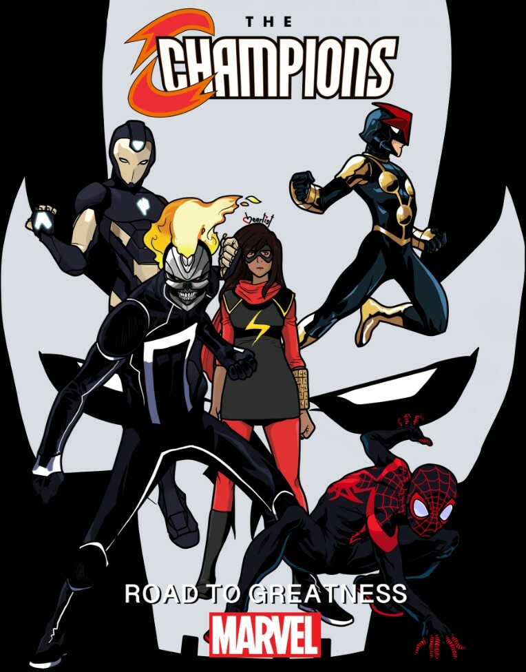
Hey there, all! I'm extremely proud of my most recent piece, and I thought I'd give you all some insight into my thought process regarding it!

General/Nonspecific Ideas: I made it to look like an actual comic cover, especially one that I would read. The focus is on the characters, each with a unique, eye-grabbing texture for their costume. As you may have noticed, the Champions are standing in front of the face of Crossbones, a dangerous mercenary from Marvel. I gave extra space between Nova and Spider-Man so that you could get a hint of his eye, and not have it be completely lost.
Miles Morales/Spider-Man: the one I started with. I experimented with having the red parts of his costume outlined in black, like I usually would. But without them, the red pops a lot more, instead of being overpowered and lost in the black. I used the blue highlights and iridescent lenses seen in Spider-Man: Into the Spider-Verse because that's easily one of the best incarnations of the character to date. It also just looks super slick, and makes it clear that it's a black costume with blue highlights, rather than a colorful costume with black shadows.
Riri Williams/Ironheart: the second character I added. Riri is pretty infamous for how poorly she's written, and I have to admit that I don't think very much of the character. Gear and I put our heads together and worked on figuring out how to go about fixing her, by adding new ideas and aspects to her character, keeping or revising what was already there that works, and leaving out what didn't. He did a spectacular job of making her into a likable character, and by tying the idea that she needs to be her own person into her arc. My end was coming up with a new look for her Ironheart suit, since the original is a little rough. It's got too many colors going on at once, and ends up looking too cluttered and visually busy. I streamlined the design and used a modified version of the black and gold colorscheme from Marvel: NOW's Iron Man suit. It's a sweet design, and I feel it should be used more. I couldn't resist the opportunity to use it here with a paler gold and blue lights. Makes Riri's armor visually resemble the idea of being initially based on Tony's designs, but being taken in a different direction.
Nova/Sam Alexander & Ms. Marvel/Kamala Khan: my two personal favorites. The different textures of Nova's suit and how light interacts with them were super fun to mess around with. When I was working on the others, I realized that all of them had black as the base color of their outfits, and Kamala was the only one with a different one, that being blue. Making her costume black turned out to work on multiple levels, by tying her into the team more, and by throwing back to the original Ms. Marvel costume worn by Carol Danvers! Gear and I have always shipped the two, coincidentally. They're really cute, what can I say?
Ghost Rider/Robbie Reyes: another favorite of mine. The borderline pitch-black suit with striking white piping is a super sick look. And the chromed-out skull shooting flame, much like a supercharger, is character design genius. It's very clearly Ghost Rider, but taken from a completely different angle by being a metal skull shooting flame as opposed to a normal skull engulfed in flame. It's one of my absolute favorite superhero designs Marvel's ever made.
I hope that you've enjoyed the piece, and reading my thoughts behind it! I love you all!
Kyo85
THIS!
This is whats make me like you and your works, the fact that you TALK! I just posted a comment into the pic post and, bam, you post this explaining exactly what I've found "strange" and why you made that way! This is something most artists must do, explain what they're doing and why, how they've come to that idea! Again, great work, you and Gear really made something to be proud of!